Inversion Submersion

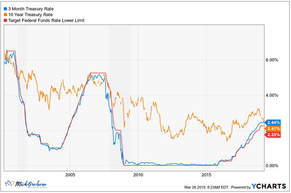
I’m one of those outliers that still believes this bull market has years left to run. However, in the interest of full disclosure, I do want to give you some data points I watch that provide a different view. One of the most widely spread view of an upcoming recession is an inverted yield curve. This means when the short-term interest rate is higher than the longer-term interest rate. The most common measure being the interest paid on the 3-month Treasury vs. the 10-year Treasury.
Last week the 10-year treasury dipped 3 basis points below the 10-year treasury for the first time since 2006. As I’m sure you recall, this inversion was followed by one of the worst recessions (and subsequent worst equity returns) since the great depression. In fact, a negative yield spread has correctly signaled all nine recessions since 1955.
There was one false reading in that time in the mid-60s. The yield curve inverted, and we went through what’s classified of an economic slowdown rather than a recession.
The big question I’m sure you are asking is, “How will this affect my investments?” The answer to this is murky at best. Of the last 10 times inversions have happened, 5 of them have occurred at or near stock market tops and the other 5 occasions the stock market indexes have seen healthy returns.
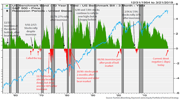
Let’s take a look at each of the last 10 in more detail and measure 12 month returns from the date of the first inversion.
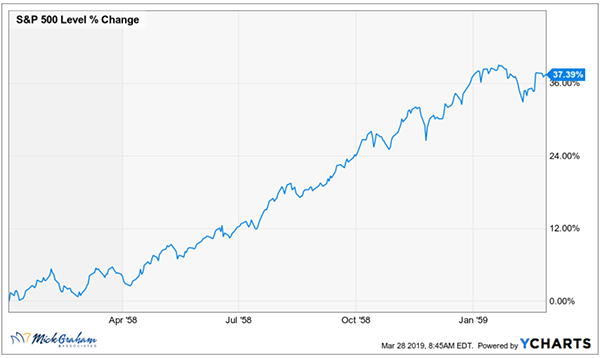
January 1958
The recession started in August of 1958 and lasted through April of 1958. The peak to trough in the S&P 500 was around 20% from July to October ‘57, and the chart you see below was the recovery from that.
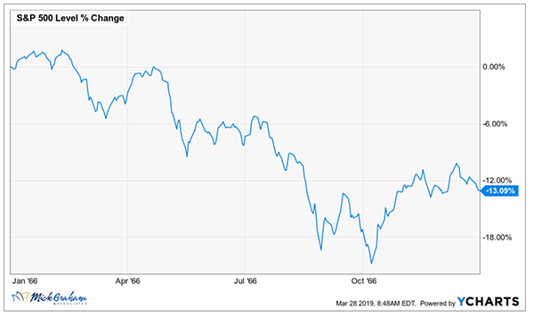
January 1966
The recession that followed the ‘66 inversion was not till 1970. This was “technically” a false reading, however led to a negative 12-month return.
December 1968
The second inversion called the top of the index before the recession.
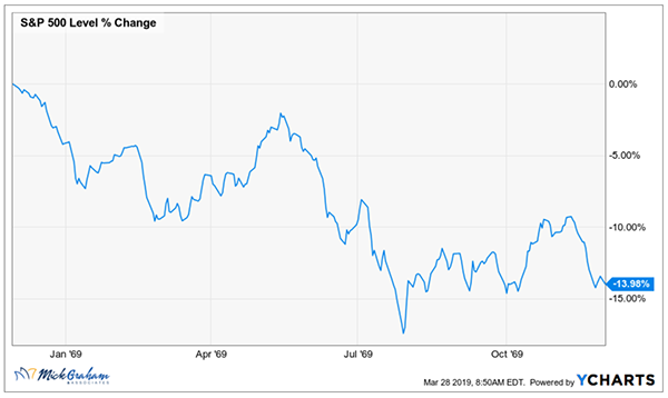
I ran the chart over the entire period to show you how that panned out through both periods since the first inversion. From the Jan ‘66 inversion the market rose around 17% before the second inversion. The 5-year return over this time was flat.
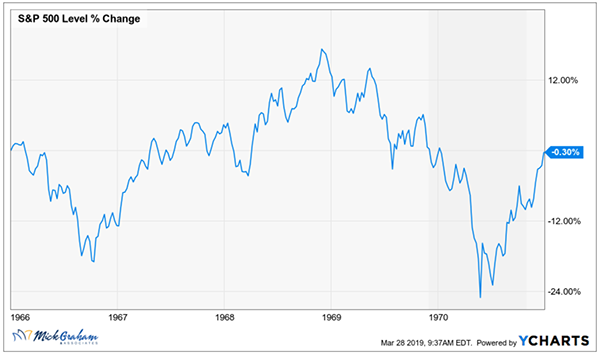
June 1973
This was an ugly recession and bear market. The index peaked around 6 months before the inversion (around 8%) but fell 40% after the inversion.
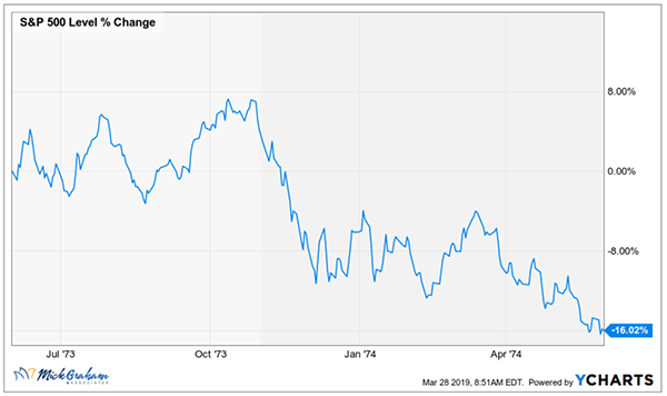
November 1978
This inversion looks and feels a lot like the ‘66 inversion. Initial stock market rally.
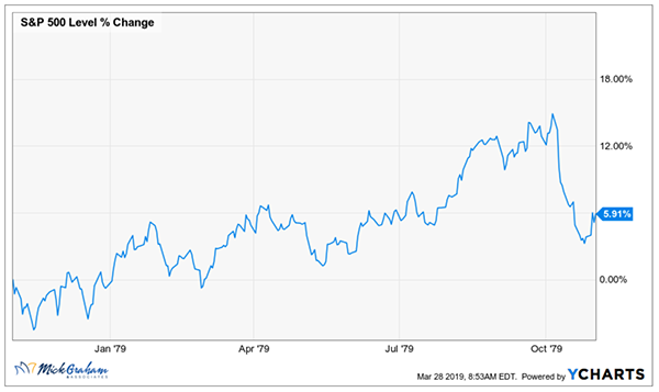
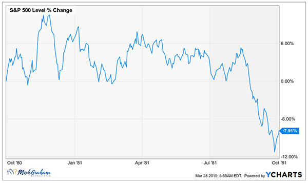
October 1980
The difference here is this inversion lasted for over 2 years and at the highest was a 300-basis point spread (3%), the highest recorded.
May 1989
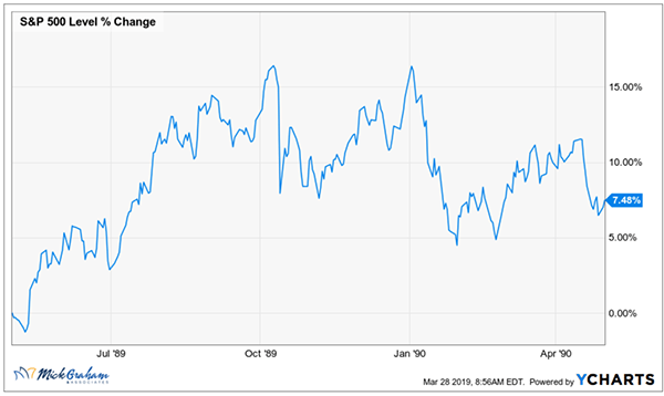
Long rates in the ‘80s came down from the highs of around 18%. It was right around that time that my parents bought their first home and I remember thinking that I would never be able to buy a house.
August 2000
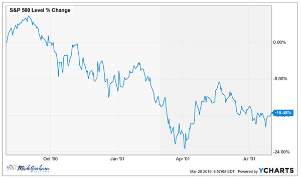
The bond market saw this valuation led bear market prior to it exploding.
February 2006
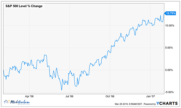
This one is still recent enough for us all to remember. Stock market rallied 21% from the inversion but ended with the longest and deepest recession since the great depression.
Summary
A lot of data this week, I know. Here’s the big picture that I want you to take away: The Federal reserve dictates short rates, the market dictates long rates. When long rates dip down below short rates, there is usually some underlying reason. My take on the current situation is that the Fed raised too quickly last year, paying little attention to the data and focusing more on their dot graph. You’ll see from the graph below the Fed is attempting to provide transparency like never before. My view is last year’s 19.78% stock market decline was more due to their concern not to change their forecast, for risk of being criticized of changing course.
As I’ve written before I prefer to look at the Global yield spread rather than any particular country or market.
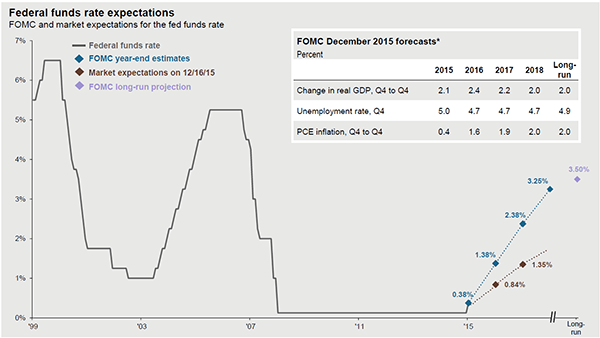
Source: JP Morgan
This is one of many data points I follow closely, but certainly not the only one. I acknowledge the track record of this data, however like a good journalist, I’ll be looking to get a second and third source before going to print….
With that here is the buy/sell
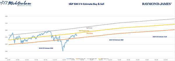
Source: MG&A
As always please feel free to call with any questions and have a great week.
Any opinions are those of the author and not necessarily those of Raymond James. This material is being provided for information purposes only and is not a complete description, nor is it a recommendation. The information contained in this report does not purport to be a complete description of the securities, markets, or developments referred to in this material.

